The internet is abuzz with Pantone’s Color of the Year for 2026…because…is it really a color?
Pantone, known for its color schemes and pigments used for fashion, home design, painting, crafts, etc., is kind of a color authority.
Pantone provides a universal language of color that enables color-critical decisions through every stage of the workflow for brands and manufacturers.
More than 10 million designers and producers around the world rely on Pantone products and services to help define, communicate and control color from inspiration to realization – leveraging advanced X-Rite technology to achieve color consistency across various materials and finishes for graphics, fashion and product design.
—About Pantone, Pantone USA
While their Color of the Year is usually an interesting choice, the 2026 pick is a miss.
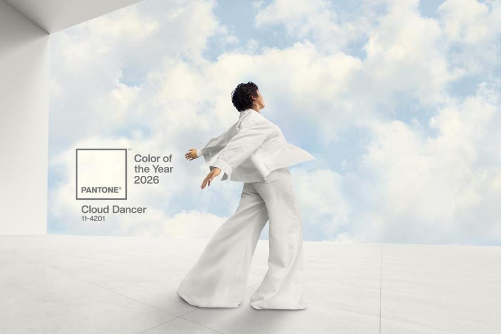
Pantone has officially announced its color of the year for 2026 — and social media is… not having it.
The color authority chose a crisp white hue called Cloud Dancer (Pantone 17-1230), describing it as a “symbol of calming influence in a frenetic society.” According to Pantone, the shade is meant to be “similar to a blank canvas” and “quiets the mind, encouraging true relaxation and focus that allows the mind to wander and creativity to breathe.”
[…]
Still, the internet seems unimpressed. The backlash was swift, echoing the groans that followed last year’s Mocha Mouse announcement:
Lidiana Rios (@ittybittylidi) didn’t hold back on Instagram: “The color of millions of boring ‘influencer’ interiors that interesting and curious design is actively moving away from… did you ask AI to come up with this? It is giving LLM-generated, it’s an algorithmic choice, it’s almost radically uninspired, I could pass out from boredom.”
— “Pantone’s 2026 Color of the Year Is White — And People Are Not Impressed,” Life & Style
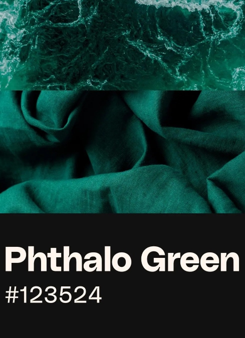
What’s social media going to do? Why, pick a new color, of course! And it seems unanimous, at least on Threads, that the 2026 color should be Phthalo Green.
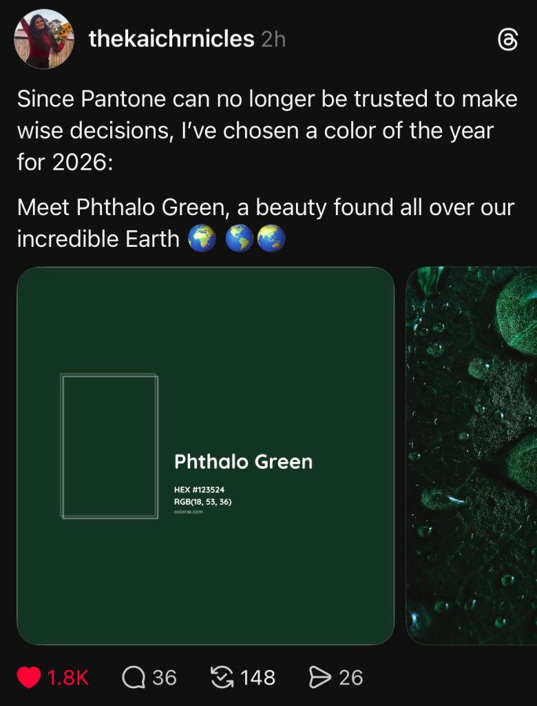
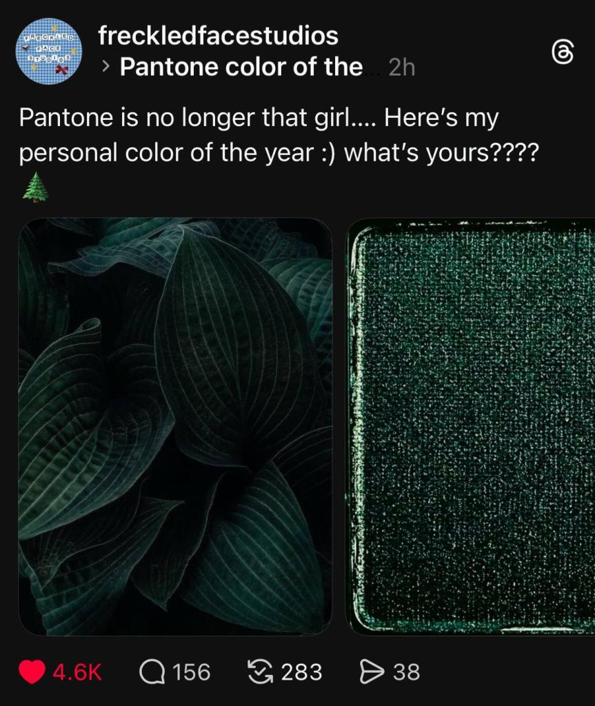
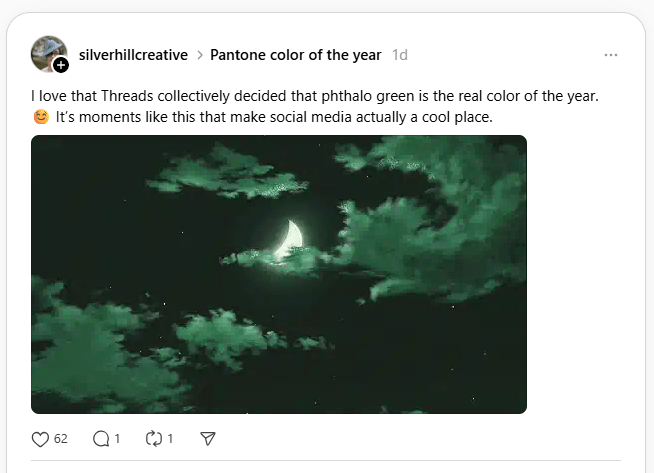
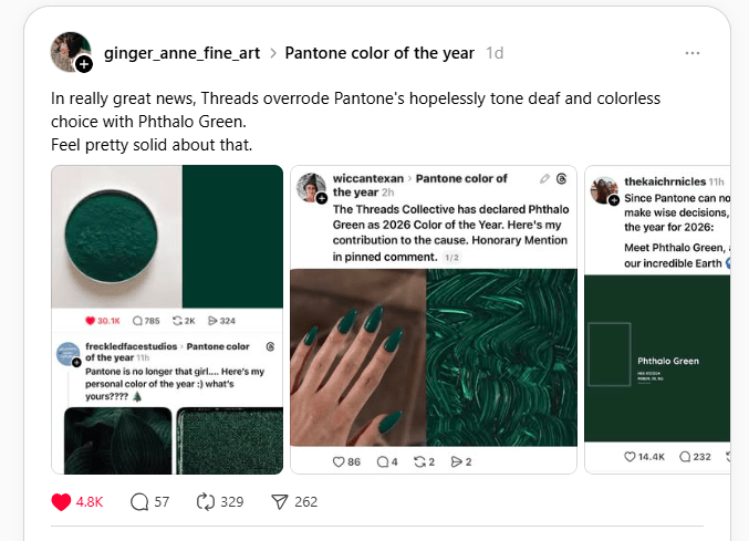
Phthalo Green is incredibly versatile, and comes in variant shades, but you’ll always be able to recognize the color once you’ve seen it. Here’s a collage of the color I made based off of social media and internet photo searches:

There’s also a great color palette that features shades that work well with Phthalo Green.

This has been absolutely amusing to see unfold on social media and has been a great distraction from the darker things going on right now. I love brilliant colors, art, and fashion, so I was very disappointed in Pantone’s choice for 2026 and wholeheartedly side with Threads on the better choice.

Leave a comment